
The Nobel Prize in medicine was awarded in October 2018 for a technology of designing T-cells of the immune system to attack cancer, to scientists from Japan and Texas, USA. Incidentally just days before, Nature published a breakthrough article where some other scientists from Texas discovered a way to engineer T-leukocytes to bypass the blood-brain barrier and attack otherwise untreatable brain cancers. A lease to life and a hope for cure, for millions of brain tumour sufferers, many of them children, all thanks to the team around the paediatric oncologist Nabil Ahmed at the Texas Children’s Hospital at Baylor College of Medicine in Houston. His lab might be small, but Dr Ahmed engaged a huge team of colleagues from Baylor College and elsewhere in Houston, Harvard, Canada and even Children’s Cancer Hospital in his home country Egypt, where the first author Heba Semaha is affiliated.
The scientific technology to get there, to spare you the complicated specialist jargon, is brazenly insolent data fakery. That, and Nature‘s tremendous impact factor, is apparently how we will defeat cancer. Smut Clyde will guide you though it, but even he has no clue how to transfer that degree of fraudulent photoshopping into clinic.
Texas Photoshop Massacre (in Nature); by Smut Clyde
Like the Force, and like duct-tape, the new digital media of science publishing have two sides. There is an admirable, encouraging trend for research reports to provide access to the experimental data with links to an archive. Over on the Dark Side, though, freed from the pressure of page space to enforce discipline and difficult choices, Figures are bloating out into unstructured, unselective omnium-gatherums. Multiple panels form a smorgasbord of cell-biology methods, depicting all aspects of an experiment in different plotting techniques, with no unifying theme or graphical coherence: grasping the logic of any one panel brings you no closer to understanding the next one.
A homing system targets therapeutic T cells to brain cancer

This recent Samaha et al Nature 2018 paper illustrates both trends. The 16 Figures (six in the main article and 10 in Supplementary Data) are like David Salle post-modernist / neo-figurative paintings: juxtapositions of multiple graphic styles, without privileging any one style as higher-priority than the others. They give me a headache. It is as if the 27 authors all contributed something, and between their 25 academic affiliations they could not agree on what to leave out.
The paper holds out the prospect of effective immunotherapy of otherwise-intractable brain cancers, by redesigning immune cells for better penetration of the blood-brain barrier. Spotting its potential as a source of citations and an adornment to the journal’s reputation, the Nature editors singled it out for headlines in the News and Views column (“T cells engineered to home in on brain cancer“), and extending the cruise-missile metaphor, as a Research Highlight in the Nature Immunology section (“Missile guidance for brain tumors“). With so many institutions claiming credit for it, the press release was circulated and went prokaryotic viral across the science-churnalism sites.
In an Update on October 25 the paper acquired the Scarlet Letter of Shame in the form of an “Editor’s Note”, which may or may not have been meant as a passive-aggressive form of an “Expression of concern”. Even now the authors will be trying to work out which of them (and how many) were responsible, and how much of the paper is salvageable. Quite possibly it will be cited often in years to come, but not in a favourable way. For as well as illustrating the trends I began with, it is also a showcase of different ways of fabricating results. One could prepare an entire Data-Faking Masterclass around it.
The critical discussion thread at PubPeer is currently up to 46 comments. It began on October 16 — six weeks after the publication date of September 6 — when ‘Gymnopilus Purpureosquamulosus‘ observed the presence, within the line-ups of fluorescent murine corpses, of some identical-twin pairs of mice.
The reuse of a few mouse portraits could be an innocent error, from researchers paying too little attention to mouse individuality. This is Nature, so duplicated images could in fact be convergent evolution. But the commentator also remarked on many other repetitions within the Figures. Subsequent commentators explored further connections, and alternative methods of dramatising the data-integrity concerns. I have picked out a few subthreads.
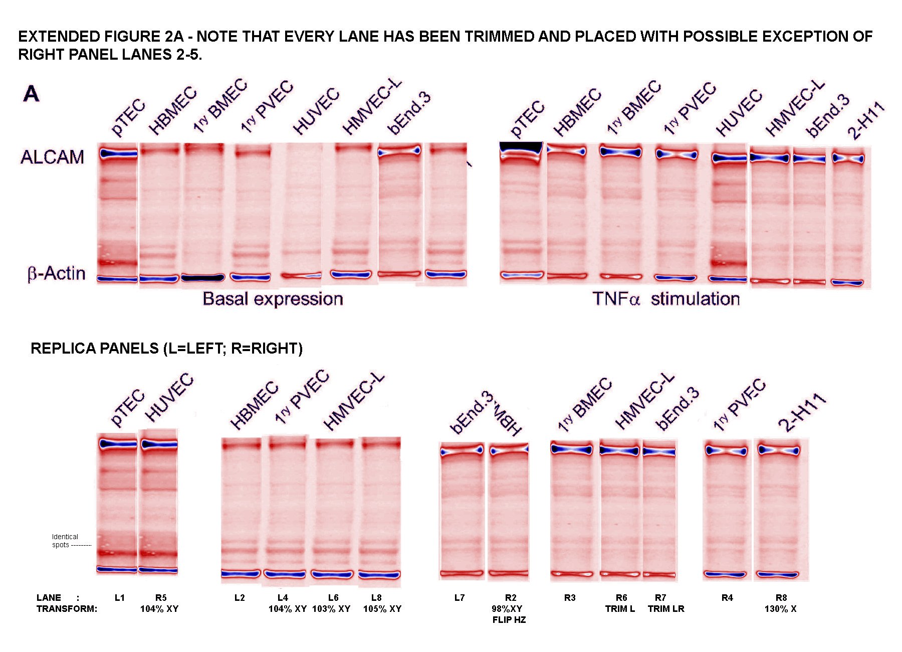
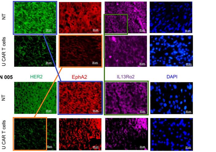
Readers come to ‘For Better Science’ expecting to see dodgy Western-Blot electrophoresis gels, and I am happy to oblige. G. Purpureosquamulosus pointed out a triplicated gel lane within Supplementary Figure S2A, supposedly representing the expression of a certain protein in different cell lines. Not just any protein, but the Activated leukocyte cell adhesion molecule (ALCAM), which is the central point of this whole exercise in Nature.

‘Leucanella Acutissima‘ extended this to Figure S2A, noting that “Many of the lane similarities are partly obscured by vertical or horizontal squishing, or by flipping”, while increasing the contrast of both images with a pseudocolour gradient map to emphasise the replications.

‘Salsola Zygophylla‘ preferred to regroup the lanes to show their family relationships.
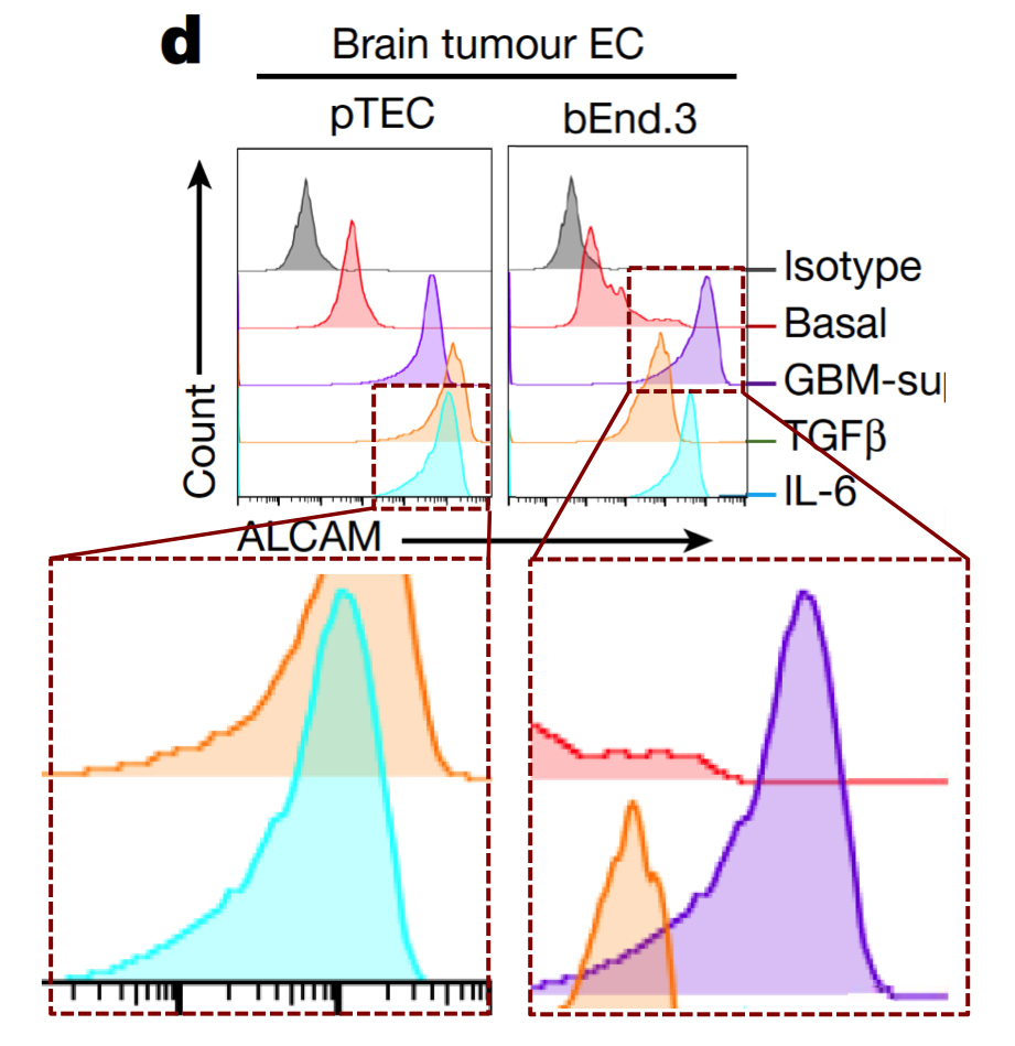
Any attempt to redesign T-cell signalling will involve flow cytometry and FACS plots: histograms (or two-dimensional distributions) of how many cells are found with different levels of some protein (or proteins) expressed on the outside of their cell membranes. Cells of the desired kind are cultured under the desired conditions, and decorated with fluorescent flags attached to those proteins so that they can be measured and counted as they are pumped down a narrow pipeline.
If identical histograms result from completely different cell lines, treated in different ways, then there is something seriously wrong. Unless you are an Italian university rector, then duplications are perfectly scientific.

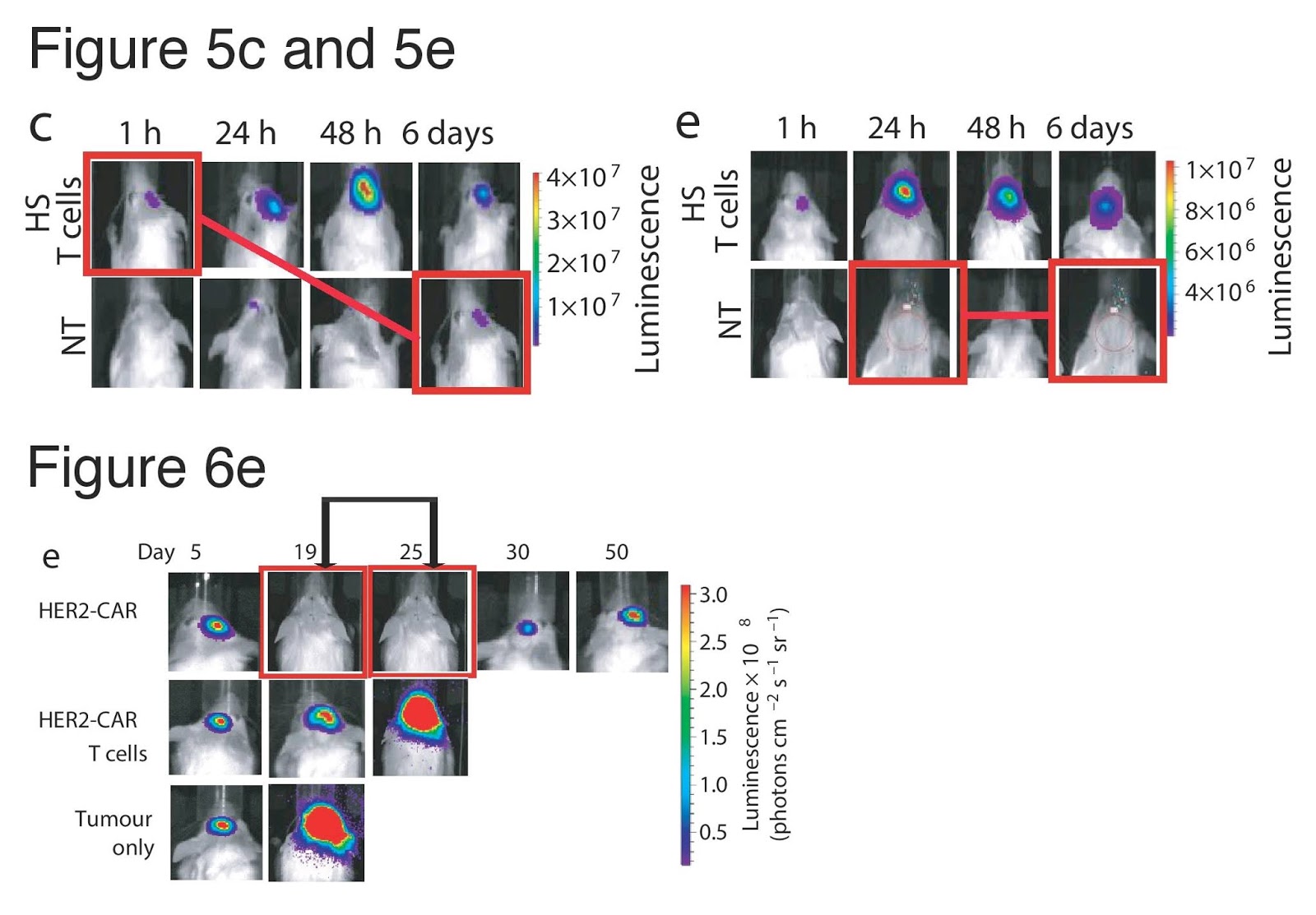
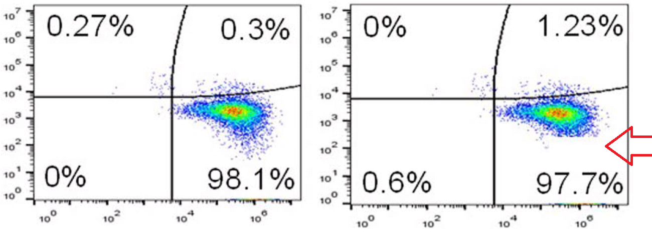
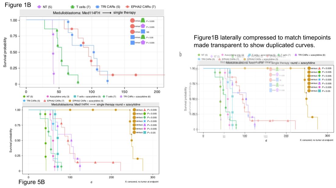
Below at left here is G. Purpureosquamulosus‘ original observation of identical two-dimensional cell-count plots in Figure 6A. At right is an extension from ‘Pseudonocardia Adelaidensis‘, where certain plots have been coloured either red or blue, and then overlapped with semi-transparency, so that dots (cells) with identical protein levels (coordinates) in both plots appear as purple.


When more points overlap than chance could explain — the vast majority of points, perhaps — this could be a clue that both plots come from the same raw file of flow-cytometry data, but with different “gating” parameters for excluding spurious signals. Unless of course you are a certain Italian university rector, then FACS improbability is your friend.
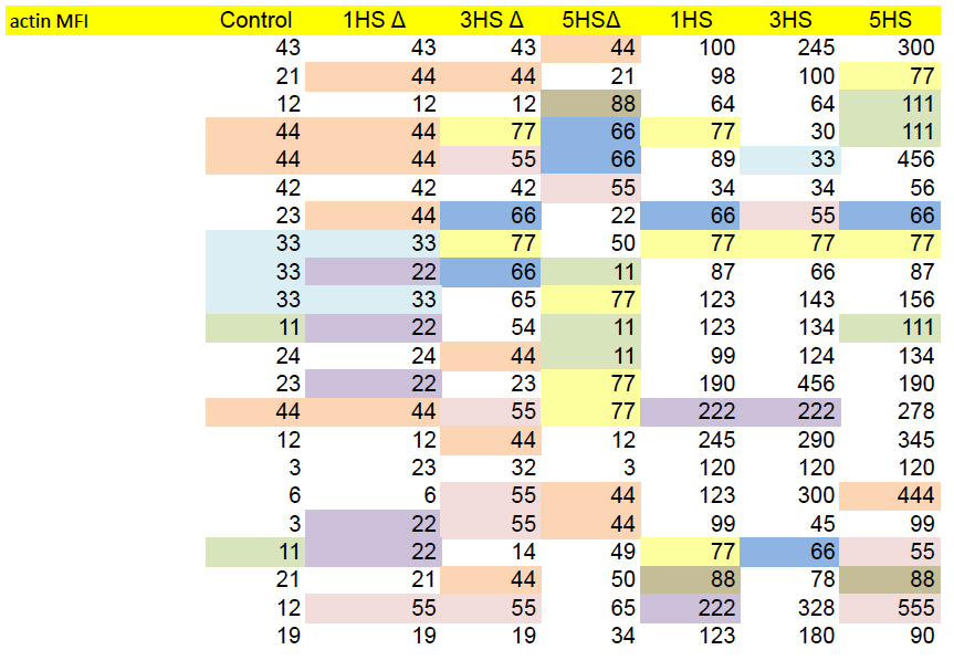
While on the topic of raw data, we have already noted the admirable trend to provide or link to raw data. This opens up new possibilities for colour-coding, as here for the Source Data for Figs 4c and 4d, to emphasise values which appear (a) unexpectedly often, or (b) in parallel between columns that come from different experiments and should be independent.
Or one can just graph the values from any two columns in a scatter-plot, expecting a chaotic cloud of points because of that independence. Certainly not expecting a diagonal line.
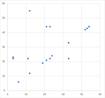
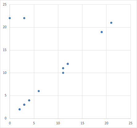
Which reminds me of how a scatter-plot appears twice in the paper, illustrating different associations between protein expression. Somehow the same distribution of points is summed up by two different correlations.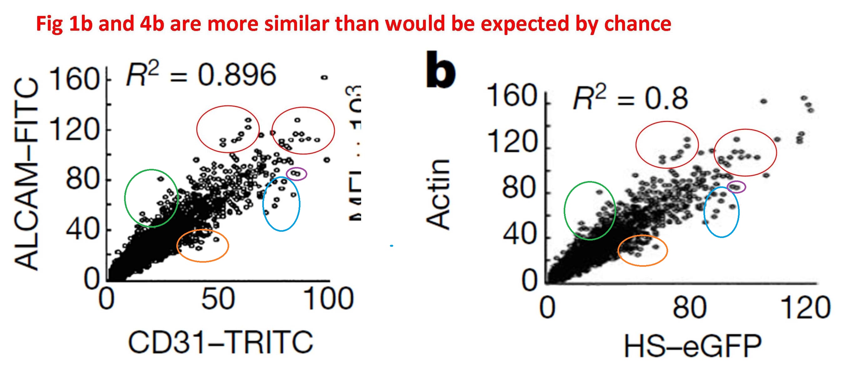
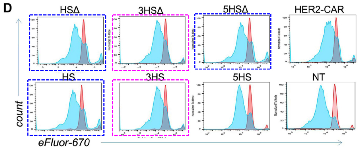
In Figures 4g and S5d, each panel is a kind of distribution of distributions. The goal is a statistical comparison, within each panel, between the populations of normal, control T-cells and altered, HS-expressing cells — the left-hand and right-hand columns respectively.
g, Characterization of migrating T cells through collective quantification of actin MFI, focal adhesions, area of spreading, and podosynapse formation by high-throughput deconvolution microscopy at HS–ALCAM interface in a representative donor (n = 200–800 cells per condition). Each column represents cells in one well.
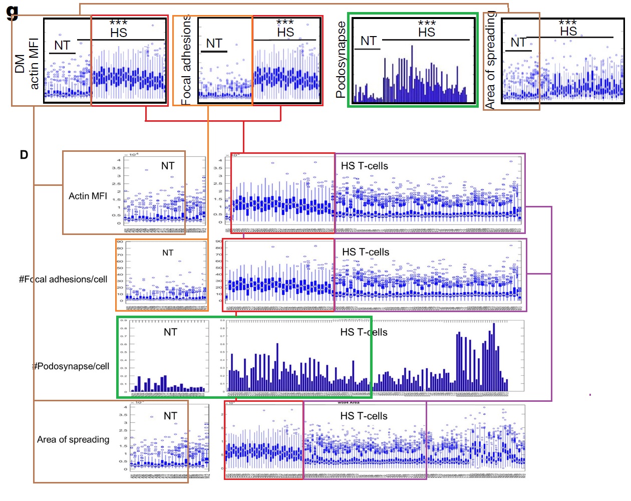
Although the panels show different measurements, sets of columns recur (with some variation in the horizontal NT and HS bars, i.e. which columns are included in which group for statistical purposes). This phenomenon could be described in several ways but “admirable thriftiness” is as good as any.
These repetitions are glaringly obvious once they have been pointed out. They are impossible to unsee. It is tempting to criticise the reviewers, and the authors of the approbative side-columns in Nature, for not spotting them… they should be looking at themselves and thinking about their poor life choices. But we need to ask ourselves here, “Would I have done any better without image-enhancement and prompting and priming?”

Is it reasonable to expect peer-reviewers to spot the cyclic repeating snaggle-teeth of Figure 1c? ‘Condylocarpon Amazonicum‘ noted this “scenic plot” of “autumnal forest colours”, “the forest march[ing] on in regular step”, but that observer was already in ‘data sleuth’ mode: assuming that the data are flawed somewhere and should be scrutinised until the flaws are found. Should this adversarial approach become part of a reviewer’s duties?
I have hardly started on the bewildering succession of enhanced and highlighted diagrams within that PubPeer thread. You should read the whole thing; it will help you imagine the plight of the peer-reviewers, confronted with a bewildering succession of diagrams in the original manuscript.
Data malfeasance is not a new phenomenon, of course. It may or may not be encouraged by the new possibilities of digital publication… or by a third trend, where funding bodies are encouraging researchers to network themselves into large-scale collaborations across institutions and across countries. This is just a particularly high-profile case, thanks to the publisher’s decision to broadcast the paper through press releases and science churnalists.
We eagerly await the outcome of the editorial investigation into the paper’s integrity (announced on October 25), to see who will be singled out as a scapegoat. It is hard to believe that a single rogue author could have faked so many different modes of data collection / presentation.
Update 20.02.2019. The paper has been retracted today. Only the first author Samaha did not sign the retraction:
“The authors are retracting this paper to correct the scientific literature, due to issues with figure presentation and underlying data. The authors cannot confirm at present the results in the affected figures and thus would wish to retract the paper”.
Update 20.05.2020
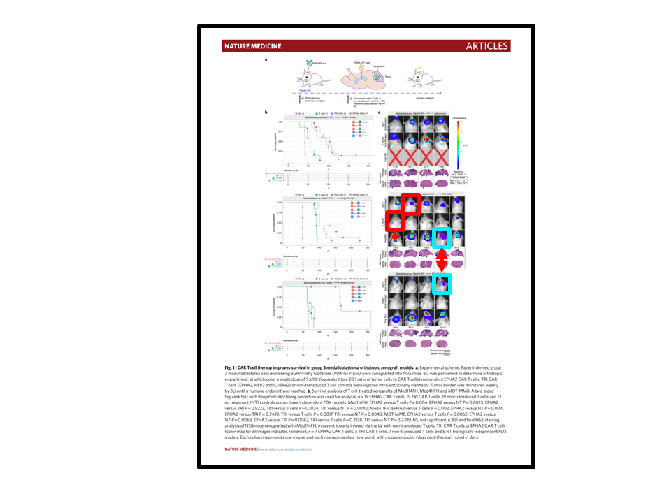
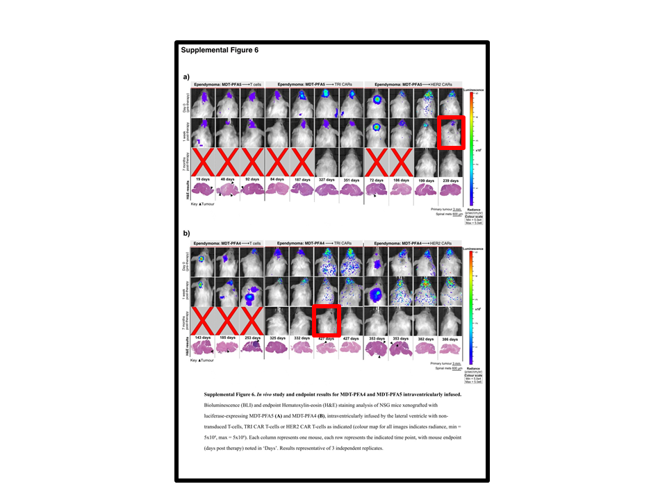
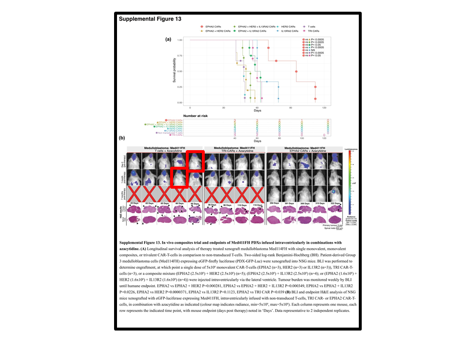
What did Nature learn from that affair? Nothing. Nabil Ahmed and his coauthor of the retracted Nature paper Michael Taylor from University of Toronto just published in Nature Medicine. This appeared on 27 April 2020:
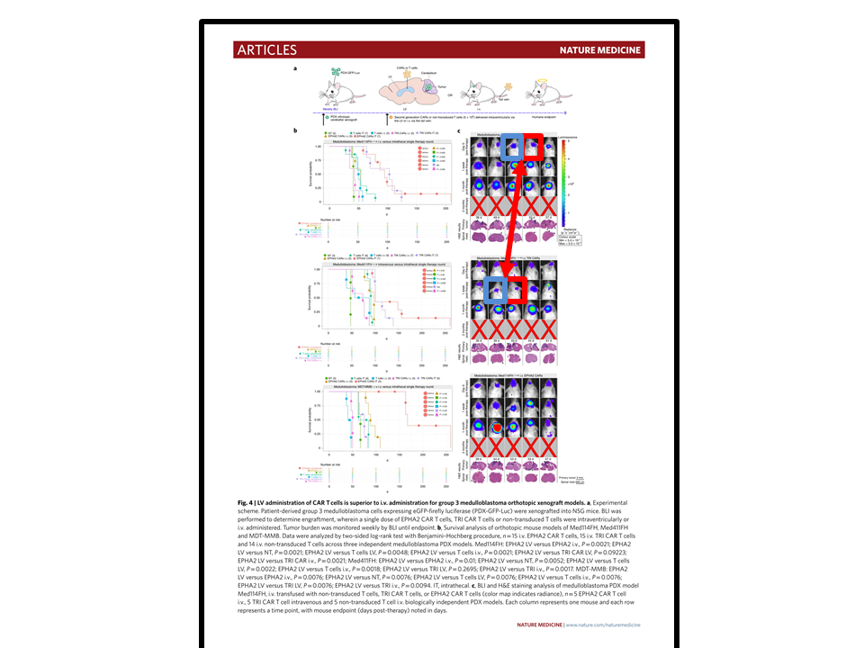
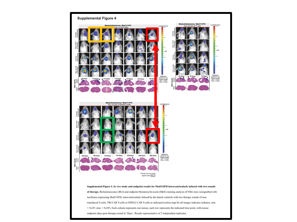
Donovan et al Locoregional delivery of CAR T cells to the cerebrospinal fluid for treatment of metastatic medulloblastoma and ependymoma Nature Medicine (2020) doi: 10.1038/s41591-020-0827-2
The paper contains exactly same kind of fake mice as the previous one.


Donate!
If you are interested to support my work, you can leave here a small tip of $5. Or several of small tips, just increase the amount as you like (2x=€10; 5x=€25). Your generous patronage of my journalism will be most appreciated!
€5.00


Very nice and imporant work by Leonid and Smut Clyde.
I am amazed by the lack of quality control in Nature.
I see duplicated data and fakeries everywhere in the literature, and
thousands of journals should have been denied access to indexing in Medline/PubMed
due to low quality and spreading of invalid and fake science.
But such an extreme case in Nature is surprising indeed!
It is a huge scandal that this work slipped through the editor and peer-reviewers,
and an equally great scandal that it has not been retracted yet.
This paper represents the alternative world of science, which has grown to a huge industry
of fakery, paid by public funds. Here, the presentation of sexy and made-up stories is
more important than the science.
If the Nature editors do care about science at all, they should have retracted this paper immediately.
LikeLike
Another notable trend in the Pubpeer discussion is the consistent mismatch between the raw data and the graphs shown, which appear to have been cut and pasted like mere graphical elements. It is tempting to say that this was a rush job, but the paper took ten months from submission to cyberprint, and hey certainly spent some time assembling that horror blot. Impressive list of supporting agencies, none of whom appear capable of due diligence. To bad the reviewers are secret, as I would like to have them do my next paper.
LikeLike
Checking back on this paper, it’s so comprehensively bad that I hope they don’t retract or correct it. It should be left in the literature as a mark of shame, while cancer researchers are encouraged to cite “the patently fraudulent report from the Ahmed group by Samaha et al.” As a cranky US politician once advised: “Make ’em famous.”
LikeLike
Unbelievable. To see so obvious fraud to pass reviewing is complete bottom line for Nature. I wonder what kind of corrections the authors will issue later. Something like “these are minor mistakes which do not affect main conclusions.” ?
LikeLike
That will be tough, since as SC points out the horror blot is the linchpin of the entire study. If that’s fake, it’s all fake.
LikeLike
Pingback: Accelerazioni - Ocasapiens - Blog - Repubblica.it
Not surprisingly there are serious problems with some other publications from the mentioned group:
https://pubpeer.com/publications/7C0AB8C689692E60CBB4F05CD7EE28#null
https://pubpeer.com/publications/684C351C0C2F57679EED64BEDB4EDF#1
+ Hegde, M et al., 2016; J Clinical Investigation (submitted..).
Seriously because these guys are dealing with patients.
Where I come from we used to say “totally Texas” if something was very wild, chaotic and out of control.
I couldn’t imagine that I many years later would use the same expression for quite many research centers in Texas.
LikeLike
Indeed.
https://pubpeer.com/publications/7C0AB8C689692E60CBB4F05CD7EE28#4
LikeLike
Looks like we will have a major challenge in finding data from this group that is not faked. At least the earlier examples let some of the authors of the Nature paper off the hook, I suppose.
LikeLike
I am perfectly happy to believe that there are forms of data in the paper that are not faked.
LikeLike
Still looking……….
LikeLike
unbelievable! Although I have been following the pubpeer thread, I’m still stunned by the facts (or fake news) listed in this post.
LikeLike
Cytotherapy. 2014 Aug;16(8):1121-31. doi: 10.1016/j.jcyt.2014.02.012. Epub 2014 May 16.
T cells redirected to interleukin-13Rα2 with interleukin-13 mutein–chimeric antigen receptors have anti-glioma activity but also recognize interleukin-13Rα1.
Krebs S 1, Chow KK 2, Yi Z 1, Rodriguez-Cruz T 1, Hegde M 3, Gerken C 1, Ahmed N 4, Gottschalk S 5.
Author information
One Center for Cell and Gene Therapy, Texas Children’s Hospital, Houston Methodist Hospital, Baylor College of Medicine, Houston, Texas, USA; Texas Children’s Cancer Center, Texas Children’s Hospital, Baylor College of Medicine, Houston, Texas, USA.
Two Center for Cell and Gene Therapy, Texas Children’s Hospital, Houston Methodist Hospital, Baylor College of Medicine, Houston, Texas, USA; Interdepartmental Program in Translational Biology and Molecular Medicine, Baylor College of Medicine, Houston, Texas, USA.
Three Center for Cell and Gene Therapy, Texas Children’s Hospital, Houston Methodist Hospital, Baylor College of Medicine, Houston, Texas, USA; Texas Children’s Cancer Center, Texas Children’s Hospital, Baylor College of Medicine, Houston, Texas, USA; Interdepartmental Program in Translational Biology and Molecular Medicine, Baylor College of Medicine, Houston, Texas, USA.
Four Center for Cell and Gene Therapy, Texas Children’s Hospital, Houston Methodist Hospital, Baylor College of Medicine, Houston, Texas, USA; Texas Children’s Cancer Center, Texas Children’s Hospital, Baylor College of Medicine, Houston, Texas, USA; Interdepartmental Program in Translational Biology and Molecular Medicine, Baylor College of Medicine, Houston, Texas, USA; Department of Pediatrics, Baylor College of Medicine, Houston, Texas, USA.
Five Center for Cell and Gene Therapy, Texas Children’s Hospital, Houston Methodist Hospital, Baylor College of Medicine, Houston, Texas, USA; Texas Children’s Cancer Center, Texas Children’s Hospital, Baylor College of Medicine, Houston, Texas, USA; Interdepartmental Program in Translational Biology and Molecular Medicine, Baylor College of Medicine, Houston, Texas, USA; Department of Pediatrics, Baylor College of Medicine, Houston, Texas, USA; Department of Pathology and Immunology, Baylor College of Medicine, Houston, Texas, USA.
Figure 6A.
LikeLike
The resemblance is striking enough to deserve higher resolution.

LikeLike
Mouse on the right is also “more similar than might be expected,” no? Did these guys get a grant from Adobe?
LikeLike
Right-hand mouse could be “Same corpse, a second later, different lighting”.
Are the dots on the ears something that mouse technicians put on to mark which group each otherwise-identical mouse belongs to?
LikeLike
Mice get both their ears punctured in certain places to code a 2 (or maybe even 3) digit number. Cutting off toes to do same is forbidden now, due to animal cruelty.
LikeLike
So mice (or mouse) in the left-hand column have a notch in the right ear for the same reason?
LikeLike
same holes means same number means same mouse. Applied 3R
LikeLike
Mol Ther. 2013 Mar;21(3):629-37. doi: 10.1038/mt.2012.210. Epub 2012 Oct 16.
T cells redirected to EphA2 for the immunotherapy of glioblastoma.
Chow KK1, Naik S, Kakarla S, Brawley VS, Shaffer DR, Yi Z, Rainusso N, Wu MF, Liu H, Kew Y, Grossman RG, Powell S, Lee D, Ahmed N, Gottschalk S.
Author information
1 The Methodist Hospital, Baylor College of Medicine, Houston, TX, USA.
Figure 5.
LikeLike
I don’t get the second one. The mice look different to me.
LikeLike
I agree they look different.
LikeLike
Reply to owlbert January 16, 2019 and ScienceWatchDogs January 16, 2019.
Many thanks for your observations. I think you are correct. False alarm for Mol Ther. 2013 Mar;21(3):629-37.
Cytotherapy. 2014 Aug;16(8):1121-31 is still problematic.
LikeLike
One remedy might indeed be to have a different kind of reviewer as well, a non-peer that has no idea about the content/methodologies etc. and reads it under the assumption that this is a fake. (Non-peer to keep a fresh mind and not go “it is supposed to look like this”)
LikeLike
In theory, actual peer reviewers are supposed to excel at that very aspect. Although I do agree that someone with experience in graphic design would have caught most of the fakery in this paper. I am surprised the copy editors and page setters didn’t notice the more egregious examples. There is also something to be said for journals having editors that check whether the data presentation (graphs, etc.) is consistent with the raw data files. In this case the latter are so chaotic that this would have taken considerable effort, which the authors themselves failed to expend.
LikeLike
I find the article far too generous to reviewers. Reviewers are supposed to be gate-keepers. It’s not their job to verify the contents of the paper, but they certainly should be able to find flaws that are standard to the field. If a reviewer is not competent to judge the statistics used in a paper, he/she should tell the editor so, to make sure someone else is brought in to do that work. Those gels are a classic example – the reviewers didn’t bother giving the images a good look – they just scanned them and moved on. And the people at Nature should be asking themselves if they are competent to do their job as well. Something’s rotten at Nature – apparently too busy engaging in a pissing match with Donald Trump over transgender issues to do the job they’re paid to do.
LikeLike
Sadly, I think this paper is about standard for the cancer research field. If you look at the other papers being flagged from this group the same pattern of sloppiness emerges. Duplicate mice and flow cytometry plots. Graphs with axis labels missing, etc. These people seem to be in such a hurry that the normal standards of science have been lost and none of them notice. I think it’s the journal that has to carry the biggest can on this one, because this turkey should have been triaged on day one.
LikeLike
Just want to note a minor milestone for this paper: 50 comments on Pubpeer, not a peep from any of the authors. Way to gut it out, guys!
LikeLike
Another milestone: featured in a review in the NEJM. PMID 30650328
This means it must be entirely accurate and absolutely true, no?
LikeLike
Interesting nugget in the disclosure form for the NEJM praise piece:
Dr. Brown has a patent WO2018/025052(A1) Chimeric antigen receptors issued to University of Oxford Innovation LTD.
Now what could block someone’s vision sufficiently to not see all those Pubpeer comments or that warning about data reliability on the Nature website….?
LikeLike
The NEJM commentary has now also been retracted.
LikeLike
Pingback: Revue de presse 20/01/2019 – Alternative